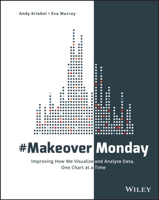
#MakeoverMonday av Andy Kriebel, Eva Murray
343,-
<p><b>Explore different perspectives and approaches to create more effective visualizations</b></p><p><i>#MakeoverMonday</i> offers inspiration and a giant dose of perspective for those who communicate data. Originally a small project in the data visualization community, <i>#MakeoverMonday</i> features a weekly chart or graph and a dataset that community members reimagine in order to make it more effective. The results have been astounding; hundreds of people have contributed thousands of makeovers, perfectly illustrating the highly variable nature of data visualization. Different takes on the same data showed a wide variation of theme, focus, content, and design, with side-by-side comparisons throwing more- and less-effective techniques into sharp relief.</p><p>This book is an extension of that project, featuring a variety of makeovers that showcase various approaches to data communication and a focus on the analytical, design and storytelling skills that have been developed through #

Relaterte produkter
Vis flereVi har valgt ut en rekke interessante produkter i samme kategori som #MakeoverMonday av Andy Kriebel, Eva Murray. Hvis du ikke finner noe interessant her kan du enkelt klikke på “vis flere”.


Produktinformasjon
- Alle prisene nevnt ovenfor er oppgitt i Norske kroner.
- Dette produktet er tilgjengelig hos Norli NO.
- Hos Norli NO kan du kjøpe #MakeoverMonday av Andy Kriebel, Eva Murray for kun 343,-.
- Den laveste prisen på #MakeoverMonday av Andy Kriebel, Eva Murray ble registrert 17. februar 2025 kl. 14:48.
Prisutvikling
Er den nåværende prisen et godt tilbud?
Grafen over prisutviklingen viser den laveste prisen over tid, eksklusiv fraktkostnader.
Prishistorikk for #MakeoverMonday av Andy Kriebel, Eva Murray
Laveste pris
343,-
17 feb. 2025
Høyeste pris
343,-
17 feb. 2025